Improving SnD's Aesthetics

Mythless

Moderator
Moderator
Joined
May 29, 2020
Messages
100
Hi. If you're bored and have a lot of time on your hands, you can read this extremely long thread.

As we all know, SnD has had a very long history—surviving for almost a decade by this point. So it's no surprise it has undergone a lot of changes for the better. Gameplay feels better, and the overall quality has gone up. One thing that remained the same throughout the years, however, is its aesthetic style.

Since the game is pretty old, some of its aesthetics feel... outdated to say the least. When an outsider looks into the mode, it's really just looks like a vanilla PvP game (and well, sure for the most part it is, but there are aspects like the bombs and kit abilities). Not to mention the very scarce amount of visual or auditory flavor in actual games—most of it is either the same old bomb warning text and sound, sounds of arrows shooting, players getting hurt, and the oh-so-familiar explosion sounds. It's not bad, but in this day and age where minigames look super flashy, it's not enough to entice newer players in my opinion.

So I propose this: An aesthetic revamp (or at least significant improvement) on Search & Destroy. From screen text, to visual flair to ear candy—I've spent the past few days crafting up a bunch of mock-ups for what I'm about to present. It's not perfect nor what it should actually be, but the purpose of showing all of it is to push this discussion forward with possible ideas of my own.


I've broken up these aesthetics into 3 categories:
General Gameplay, Kit Menu, & Kit Gameplay
 
Last edited:

Mythless

Moderator
Moderator
Joined
May 29, 2020
Messages
100
For the most part, all of the major gameplay stuff has been in the chat. Not really stylistic nor fully intuitive with how easily clogged the chat log can be. So, SCREEN TEXT! Specifically—action bar and subtitle text. They can help display current notifications better and are at least a bit more user-friendly since they can just take a glance without being too intrusive.

There are also a lot of gameplay notifications that do not have any sound cues. Understandably, the amount of these sounds could feel too annoying if they happen too frequently, so I tried to not put too many SFX, or choose SFX that can get too annoying when played multiple times.

So, did you get any of that? If you're not much of reader, you should instead watch this video that showcases various mock-ups for these new gameplay aesthetics:

Alright, this is gonna take a bit to explain. You know how games in general like to give you, or even just nod to you that "hey, this game has a variety of different playstyles. We sorted them into cool archetypes so you have an easier time deciding what you want." Well, that's basically what the new Kit Menu will be.

During lobby time, there should be an additional menu item in the form of a book.

2021-04-15_19.46.46.jpg

Click on said item, and you will open up this menu.

2021-04-15_19.47.00.jpg

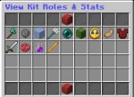
Introducing Kit Roles & Stats!

This menu is all about helping players associate kits with certain playstyles (while also making them look more interesting from an outsider's perspective) by categorizing kits into one of 5 main Kit Roles. You can hover your mouse over each of the glazed terracotta blocks to read up on what each of those roles entails for the kit. To copy each of their hover texts verbatim:

  • FIGHTER ROLE: Kits oriented towards combat on the front lines. Primarily made of melee-ranged kits with abilities that aid their blood-thirsty endeavors.
  • RANGER ROLE: Kits that excel in dealing damage from afar. Primarily made of archers and those with long-range or remotely-activated abilities.
  • SUPPORTER ROLE: Kits that are dedicated to directly aiding their allies. Primarily made up of healers and those that are able to give other positive effects.
  • DEFENDER ROLE: Kits that are geared towards protecting themselves, their bomb, or their allies. Primarily made up of the highly-armored and/or those that can place defensive obstacles on the battlefield.
  • SNEAKER ROLE: Kits that are designed to carry out covert or illusory operations. Primarily made up of those who cannot easily be tracked and be seen, as well as those who are able to deceive enemies.
In addition to defining a kit by its role, there is also a more vague measurement called Kit Stats. Like the glazed terracotta, you can hover over each of the items to read up on each stat. the Redstone Lamp gives a general description on what Stats are:
  • What Are Kit Stats?: A kit's general capabilities is loosely defined as a collection of 4 main traits. Each trait is scored on a scale of 0 - 5 points. Do not treat these stats as the be-all-end-all! They are simply a vague depiction to help you get a picture of that kit's playstyle.
So yes, as you've read, there are 4 main traits. I'll explain each of them verbatim from their hover text:
  • Attack (Atk.): Defines a kit's ability to deal damage—measured by its Damage Per Second (DPS). Takes into account the kit's basic weaponry and abilities that improve its damage output. More Atk = Higher Potential DPS.
  • Defense (Def.): Defines a kit's ability to soak enemy damage. Takes into account the kit's basic armor as well as its abilities that help improve survivability. More Def = Greater survivability.
  • Mobility (Spd.): Defines a kit's ability to travel around the battlefield. Takes into account the kit's abilities that affect its overall movement style. More Spd = Faster and/or easier travel.
  • Affinity (Aff.): Defines a kit's ability to work with their allies to perform its role effectively. Takes into account abilities that are influenced or require teammates. More Aff = Greater reliance on allies.
On another note: If you click on each of Roles represented by the glazed terracotta, you will be brought to a menu that displays all the kits that occupy said role. Example:

2021-04-15_19.47.09.jpg

And on top of all of that, each kit's hover text gets an automatic upgrade with these cool new Roles and Stats. Check out Trooper for example:

2021-04-15_19.45.33.jpg

Alright, so at this point you're probably thinking at the back of your mind: "What's the point of all this? Isn't all of it just a bit excessive for just minigame kits?

Duly note that the aesthetic value this kind of concept provides would certainly entice newer players if they see something like this. It's the same reason some people spend so much time creating a custom avatar. By simply adding this perceived level of depth to the kits, players can feel more attachment to these kits since they are presented the option to pick something that suites them. That's powerful marketing in-and-of itself. Showing this new kit menu can also become a potential way to advertise the server since it's made clear that this is indeed a Minecraft minigame, and not just a chest full of custom-lore items and whatnot.

Not to mention—it actually does help newer players ease into the game more since there is more easily-accessible information about the kits specifically. Right now all they have to go off of is the kit's description and its starting equipment by looking into the Modify Kit Layout menu, but that tells them nothing about how the kit should be played—so usually they'd either buy a kit they have no idea how to play or play against such a kit. Both can lead to enough confusion/discouragement that they'd quit altogether, so getting a general picture of how that kit should be played through its Role and Stats can alleviate this issue somewhat.
Right now the kits all look pretty lackluster in terms of looks and sounds, but if it becomes too flashy then it starts to become a bit intrusive on actual gameplay. Still, you can do some pretty creative stuff with these aesthetics—like having certain kits cue their own "unique" attack or hurt sounds, or showing subtle particle effects for certain actions. Minimal stuff like that would probably do the trick best.

Below is a video showcasing the mesh of ideas I personally made up for each kit's aesthetics. It's all just a mockup—all I can do is cobble up my meek knowledge of command-block do-hickery (and also some minor video editing to make up for that meek knowledge), so don't expect supremely epic animations or anything. Still, I think it helps get the point across. Oh, some kits won't have any aesthetic improvements—mainly because it's either Trooper (Gotta keep that vanilla vibe on that one) or because their current aesthetics feel sufficient enough personally.

When watching, you may notice these *Visible and *Audible tags. This describes who are able to see or hear these aesthetics. For example: *Visible: User means only you, the user, can see these visual effects—same logic applies for the *Audible tag. I defined it this way because in actual gameplay, some of these aesthetics could be used for intel about you or the enemy—I want to prevent that as much as possible. It also makes it a bit less intrusive with all these different visuals and sounds being played in the heat of battle.


Don't like all these new weird and wacky visuals/sound effects? Have a potato laptop that can't handle all these flashy features? No problem! You can get rid of them on your end by turning on the "Minimal Kit VFX" and "Minimal Kit SFX" preferences respectively. They essentially revert back to the kit aesthetics we have right now.

If you want to get a 1st-Person look or geek out over the different Role & Stat combos I came up with for the Kit Menu stuff in a chest somewhere, you can download the map I used to showcase everything. All the commands should work properly, so all you gotta do is just press buttons and flick levers:

https://www.dropbox.com/s/2ik0kv0rpbgm9x7/SND AESTHETIC.zip?dl=0

Feel free to offer your own ideas or give feedback on mines. Whatever the case—the goal here is to start discussion on how we can make SnD look more eye-catching and refreshing for both new and old players. :)
 
Last edited:

Onett

Well-known member
Joined
May 25, 2020
Messages
166
this is super dope, i really respect the amount of effort you put into this.

Here are some of my thoughts:

I like how you integrated the new effects, most of them are simple but add a nice touch to the overall aesthetic of the game. This is a pretty minor complaint but, personally I'm not really a fan of giving custom hit sounds for kits like berserker and venom. I feel like it could get a bit annoying. Might just be me tho. The rest of the other effects I'd be hyped to see implemented.

Concerning the kit menu, I think it might be better if we could maybe just integrate its design into the kit selector instead having it be its own separate thing. That way it is immediately clear to newer players of how they can find a kit that matches their playstyle. It would definitely be a step up of just showing new players a wall of random items imo.

The combined kit selector/menu would basically just be the kit menu, but with an option to see all of the kits (what you would normally see with the current kit selector).

Honestly, don't have anything else to say. Again, great work man :) Hopefully we can see this implemented one way or another.
 

toomuchzelda

Active member
Joined
May 30, 2020
Messages
59
this will freshen up the carcass that is snd.

id just like to add i think any added particle effects should be toggleable since they're a real fps killer on older computers.

and the same for anything that uses the title (screen filling text) during the game because it's very annoying

Concerning the kit menu, I think it might be better if we could maybe just integrate its design into the kit selector instead having it be its own separate thing. That way it is immediately clear to newer players of how they can find a kit that matches their playstyle. It would definitely be a step up of just showing new players a wall of random items imo.

The combined kit selector/menu would basically just be the kit menu, but with an option to see all of the kits (what you would normally see with the current kit selector).
i think this would be lame because im not a new player and just want to select my kit and extra movement and button press would be approximately 1 extra second to my kit selection process which is extremely painful and unbearable. its gonna suck to learn which kits are under which categories.

otherwise, great ideas
 
Last edited:

Elitemaster5

Moderator
Moderator
Joined
May 30, 2020
Messages
50
Really nice post Myth. I think these are all great ideas that will help Snd stay fresh and attract more players.

I especially like the General Gameplay effects and screen texts. I know nothing about coding, but I feel like those are some minor changes to the game that can have a great impact. I hope a lot of this stuff gets implemented because I can see it being a big hit.

Awesome post, keep up the great work.
 

Mythless

Moderator
Moderator
Joined
May 29, 2020
Messages
100
Concerning the kit menu, I think it might be better if we could maybe just integrate its design into the kit selector instead having it be its own separate thing.
i think this would be lame because im not a new player and just want to select my kit and extra movement and button press would be approximately 1 extra second to my kit selection process which is extremely painful and unbearable. its gonna suck to learn which kits are under which categories.
Perhaps the best of both worlds would be something like this: How about when using the Kit Select menu, all the stuff shown in the Kit Menu will instead be in the player’s inventory? No additional button pressing if you don’t want to, but you still have the option to read up on that info all in the same place. And perhaps when you click on the glazed terracotta, it instead just filters the Kit Selector to only show kits from that role that you can then choose from.

Now that I think about it, that would probably feel way more streamlined than having it be its own item lol
 
Last edited:

pigpig24

Member
Joined
Oct 1, 2020
Messages
27
Love it, Myth!

As someone easily freaked out, though, I really don't like the "Wither released" sound. It gives me the heebie-jeebies. (Did Death God use it? Because I hated the Death God sound effects.) For another sound thing, I don't figure the countdown needs the ascending clickss??? It's already got the "Creeper dies" and all. Also, I think it would be a nice touch for the "Game starts in" to be in your team's color, because that's more reinforcement as to which team you're on (which is useful for forgetful players like me)!
 

Woaxa

Staff Member
Administrator
Joined
May 25, 2020
Messages
115
Love it, Myth!

As someone easily freaked out, though, I really don't like the "Wither released" sound. It gives me the heebie-jeebies. (Did Death God use it? Because I hated the Death God sound effects.) For another sound thing, I don't figure the countdown needs the ascending clickss??? It's already got the "Creeper dies" and all. Also, I think it would be a nice touch for the "Game starts in" to be in your team's color, because that's more reinforcement as to which team you're on (which is useful for forgetful players like me)!
Death god used enderman death sound I believe. Also leave it to myth to make such a detailed thread, love the idea but going along with some stuff previous people have said I think all the bonus stuff should be toggleable as old players would probably do without a lot of it, but that should be fairly easy just adding it in as a preference. I'm sure this will be talked about internally :)
 

Busjack5

New member
Joined
Jun 17, 2020
Messages
5
Haha, Yes! I strongly yes. I agree with all the confirmations I can give. You have the go ahead with my opinion and obligation. Thank you for the idea plus this thread made me feel like I’m old but that’s ok I agree genuinely with all that was said
 

Log in

Join our Discord!

Members online

No members online now.

Forum statistics

Threads
484
Messages
2,521
Members
262
Latest member
carbon12